
React widgets
@meisei/widgets is the React package behind the
storefront widgets. If your storefront is a React app, you can import the
widgets directly instead of dropping in the embed script, and you can take any widget apart
and lay its pieces out yourself.
This page covers the three depths you can work at, the parts each widget exposes, and the props each part takes. It is precise enough to build from, so if you hand it to a code assistant, hand it the whole page.
On Next.js, read Next.js and Vercel Shop instead. It covers the same widgets, with their data loaded on the server.
Setup
Wrap the part of your tree that renders widgets in a MeiseiProvider. Every connected
widget reads the API base URL, the publishable key and the signed-in customer from it.
baseUrl is your store's own address with /api on the end, which
Settings → General prints under
Address. There is no default, so the widgets say what to set and stop if you leave it
out. On Next.js the provider reads MEISEI_API_URL instead (see
Next.js).
customerAuth is the same signed trio the embed script takes. See
Identifying the customer for how to make it.
Leave it null for a signed-out shopper.
Pass agentTools to let an AI agent in the shopper's browser read the reviews, ask about a
product, check their rewards and save to their wishlist. See
AI agents.
Each widget's stylesheet is imported by the widget itself. The custom properties and class
names in Appearance apply exactly as they do to the embed, so a
theme set in the dashboard reaches a React storefront too, provided you link the served
stylesheet from your page's <head>.
Two components per widget
Every widget ships as a pair:
The connected widget talks to the API: it fetches, paginates, votes, submits, and handles the shopper's sign-in state. The presentational component takes everything as props and fetches nothing. You will mostly use the connected one; the presentational one is for when you already have the data, or for a preview against sample data.
Level one: drop it in
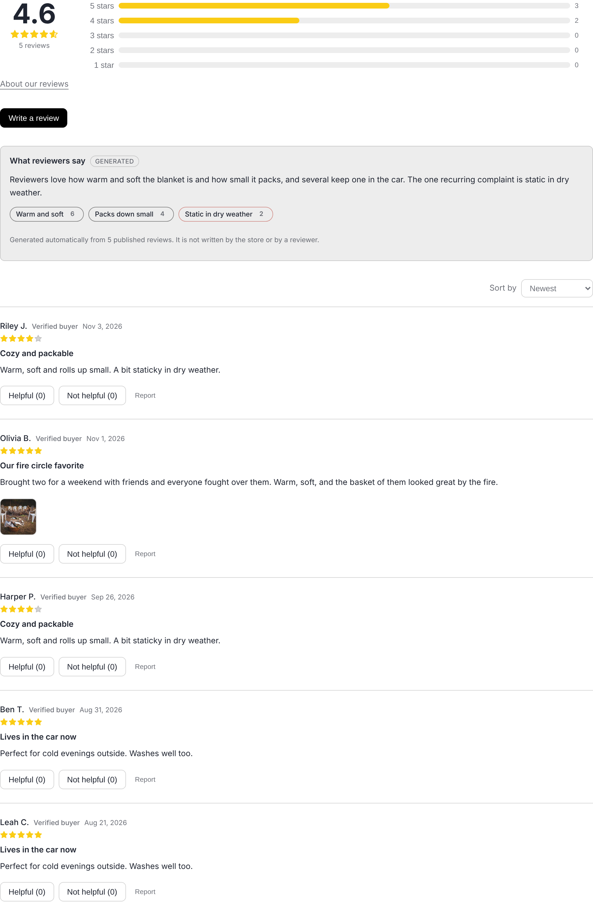
Every connected widget renders its default composition when it has no children. Its props are listed under Connected widget props.
Level two: lay the parts out yourself
Give the connected widget children and it renders them instead of the default composition, inside a root it has filled with what it fetched. Each part reads that data and draws its own internals. How the parts sit relative to each other, and any markup between them, is up to you.
Four rules hold for every widget:
- Parts are properties of the presentational component,
ProductReviews.List, never separate imports. Import the presentational component to reach them. - A part takes no data props. It reads the root. Leaving a part out leaves that piece off the page; a part with nothing to show (no summary, no more pages, no form handler) renders nothing.
- The root element and its class names are unchanged. The connected widget still
renders
.meisei.meisei-reviewsaround your children, so custom CSS written against the documented classes keeps applying, and anything with structured data still emits it. - With the presentational component, the root is explicit. Pass the same props you
would pass to the component to
<ProductReviews.Root>and put the parts inside it. The connected widget does this for you, which is why you do not writeRootinside it.
Level three: recompose a row
A list part renders its children once per item, inside a context holding that item. With no children it renders the default row. So a review row can be rebuilt from its own parts, or replaced with a component of yours:
Every widget with a list exposes the same shape: a list part that takes children, a default row, and a hook that returns the current item. The hooks are listed per widget below.
Writing a part of your own
Every presentational component exposes useData(), which returns what its Root was
given with defaults applied, plus any state the root keeps for its parts (which tile is
open, whether the popover is showing). A custom part is an ordinary component that calls
it:
A hook used outside its root throws with the name of the root it needs, for example
This part has to be rendered inside <ProductReviews.Root>.
The parts, widget by widget
Each table lists a part, what it renders, and when it renders nothing. A part's props are
listed where it takes any; most take none. children on a list part are rendered once
per item; empty replaces the default empty state.
ProductReviews
Root element: div.meisei.meisei-reviews. Default order: Summary, AboutReviews,
QuestionSummary, WriteReview, AiSummary, AskBox, Toolbar, List and LoadMore.
ProductReviews.Review parts, valid inside List:
ProductRating
Root element: div.meisei.meisei-rating. Default: Stars, then Count unless
hideCount.
ReviewsCarousel
Root element: section.meisei.meisei-reviews-carousel. Default: Header, Track.
With no reviews the root renders the empty state (or its empty prop) whatever children
it was given.
ReviewsCarousel.Card parts, valid inside Track: Root (li.meisei-reviews-carousel-card,
takes children), Rating, Title, Body, Image (the first photo), Footer (name
and verified badge), Product (nothing unless showProduct and the review names one),
and useCard() for the current review.
MediaGrid
Root element: section.meisei.meisei-media-grid. Default: Heading, Tiles,
LoadMore, Lightbox. With no items the root renders the empty state (or its empty
prop) whatever children it was given.
A custom tile should call open() from useTile() to show the lightbox, and the
composition should include <MediaGrid.Lightbox /> somewhere for it to open into.
CustomerWishlists
Root element: div.meisei.meisei-wishlists. Default: ErrorNotice, Overview,
Detail, ShareDialog. The Overview parts render only while no list is open and the
Detail parts only while one is, so a composition can include both.
AddToWishlist
Root element: div.meisei.meisei-add-to-wishlist. Default: Controls, Popover,
Toast, ErrorNotice. The root closes the popover on a click anywhere outside it.
WishlistsModal
Root element: dialog.meisei.meisei-wishlists-modal. This root is the exception.
Its children are the dialog's content, not a default composition, because a modal has no
default content of its own. <WishlistsModal> itself renders
Header then Body around its children.
The variant prop picks where it opens: modal (the default) sits in the middle of the
viewport, and sheet docks to the right edge at full height and slides in. The manage
dialogs use the sheet; the share dialog stays a modal.
WishlistsModalWidget has two parts of its own, since it owns the open state:
WishlistsModalWidget.Trigger (the button) and WishlistsModalWidget.Dialog (the
sheet, holding <CustomerWishlistsWidget /> unless given children). Pass children to
the widget to place them apart.
LoyaltyPanel
Root element: div.meisei.meisei-loyalty. Default: Header, Notices,
ProgramTabs, ErrorNotice, HeldRewards, Sections. Without
a program the root renders the "no program yet" line (or the error) whatever children it
was given.
A custom row inside any of the list parts should render its own <li>; the list part
renders the <ul>.
LoyaltyLauncher
Root element: div.meisei.meisei-loyalty-launcher. Default: Panel, Button.
<LoyaltyLauncher> itself puts its children inside Panel.
LoyaltyPoints
Root element: a.meisei.meisei-loyalty-points when href is set, otherwise
p.meisei.meisei-loyalty-points. Default: Label. The root renders nothing at all
when points is zero or less, whatever children it was given.
Loading on the server
Every connected widget that fetches on mount also accepts initialData. Pass it and the
widget draws on its first render, on the server and in the browser, and makes no request
until the shopper sorts, filters or asks for another page. A search engine can read reviews
that are in the HTML, and a shopper on a slow connection sees them straight away.
Each one has a loader that returns exactly that shape. Loaders are plain async functions
with no framework in them, so they work in a Next.js server component, a
getServerSideProps, a Remix loader or any server of your own:
Every loader takes your store's baseUrl and one key: apiSecretKey for a server, or
apiPublishableKey if that is all you have. Use the secret key on a server, because the
publishable key is rate limited per address. One server rendering for every shopper would
spend a single shopper's allowance. See Rate limits.
fetch and init are passed straight through, so init: { next: { revalidate: 60 } }
or a fetch of your own works as usual. loadProductRating takes a list of slugs and
answers for all of them at once, so a category page loads every rating on it in one
request and hands the same response to each widget.
A page with several widgets can load them all in one request. Make one reader per page with
createWidgetReader({ baseUrl, apiSecretKey }) and pass it to every loader as reader.
Loaders called in the same tick then go out together as one
GET /widgets/boot rather than one request each.
In the browser you do not need a reader. Every widget inside one MeiseiProvider asks for
its first view through the provider, and the provider sends the page's reads together.
signCustomer({ baseUrl, apiSecretKey, email }) returns the signed trio for
<MeiseiProvider customerAuth={...}>, so a signed-in shopper's wishlists and points can
be loaded on the server too, without your code holding the signing secret.
On Next.js, use @meisei/widgets/next instead of calling
these by hand. It has a provider and a server component per widget that do all of the
above, including the theme stylesheet and signing the shopper in.
Connected widget props
The connected widgets take the props below, plus children on every one of them, plus
initialData on the ones listed under
Loading on the server. Without initialData a connected widget
renders nothing until its first response has arrived, so a part never sees a half-loaded
root; with it, the first render is drawn from what you passed.
Every widget that shows one product takes either productSlug or productExternalId, the
product's ID on your store (a Shopify product ID, say). An ID keeps working when the product's
slug changes. If you have several sites and the same ID is on more than one of them, also pass
site, the slug of the site you mean, to the widget or once on MeiseiProvider.
context on ProductReviewsWidget is the store's notes for the instant answer, and
pageContext is what the page says about the product. If you leave it out, the widget reads
the page itself (title, meta descriptions, any schema.org Product). A string is used as is,
and false sends nothing beyond the product's stored description. See
Instant answers.
What children do not change: ProductReviewsWidget and ProductRatingWidget still emit
their structured data, AddToWishlistWidget still renders the manage dialog beside the
button, and CustomerWishlistsWidget still switches between the signed-in and guest
lists.
Presentational component props
The presentational components' props are the data the connected widget would fetch plus the handlers it would wire up. They are typed in the package. The main shapes are:
ProductReviews:averageRating,totalReviews,ratingBreakdown,reviews,hasMore, and optionallysummary,reviewAnswers,reviewStatement({ text, url }, what the About our reviews link shows),sort,activeRating,loading,signedInEmail, the star props, and the handlersonLoadMore,onSortChange,onRatingChange,onVote,onReport(a shopper's report on one review, as(reviewId, { reason, note })),onSubmitReview,onUploadReviewFileandonAsk(the instant answer).ReviewsCarousel:reviews,heading,showProduct, the star props.MediaGrid:items,heading,showProduct,hasMore,onLoadMore,loading, the star props.CustomerWishlists:wishlists,activeWishlist,error,loading,sharingEnabled,multipleWishlists,guest, and one handler per action.AddToWishlist:wishlists,loading,pending,error,disabled,multipleWishlists,onToggleDefault,onAddToWishlist,onRemoveFromWishlist,onManageWishlists.LoyaltyPanel:program,programs,loading,error,canJoin,currencyCode,onJoin,onClaim,onCancelReward,onSelectProgram.LoyaltyPoints:points,pointsNames,member,href,className.
Every type is exported from the package root: Review, ReviewSummary,
CarouselReview, MediaGridItem, WishlistSummary, WishlistDetail, WishlistItem,
AddToWishlistOption, LoyaltyProgram, LoyaltyMember, LoyaltyRule, LoyaltyReward
and the rest.
A worked example
packages/example-custom-store in the Meisei repository is a React storefront that uses
the connected widgets on every page that has one. Its product page lays the reviews
widget out from parts: the rating summary, the breakdown and the write button in one row,
then the rest in the default order. See Custom integration
for the store as a whole.